Ever since I started ENDDLESS, I've been struggling with the headline font, the one used for the post titles. For the body text, I'm using Courier because it gives me work-in-progress vibes, and that's exactly what ENDDLESS is: a work-in-progress journey. I also tried Courier for the headings, but it didn't feel right. It didn't sit in its place, not even Courier Bold in combination with Regular. Then I tried another default, a safe option: Helvetica. But even that didn't feel right. A custom font from my own foundry would make sense, right? But which one…? Perfectionism. Chaos. Error.
Then I came across an awesome Pinterest post that perfectly captured the feeling I'm going for with ENDDLESS. It was a mysterious image of a model with their head completely covered in shadow and a big bold logo on the front of a T-shirt. It gave me Jil Sander vibes. So I made a mockup, removing the text and replacing it with "ENDDLESS" in Futura, and it worked as a logo. Putting a logo on a T-shirt is always a good indicator of whether it works or not, and this one definitely did.
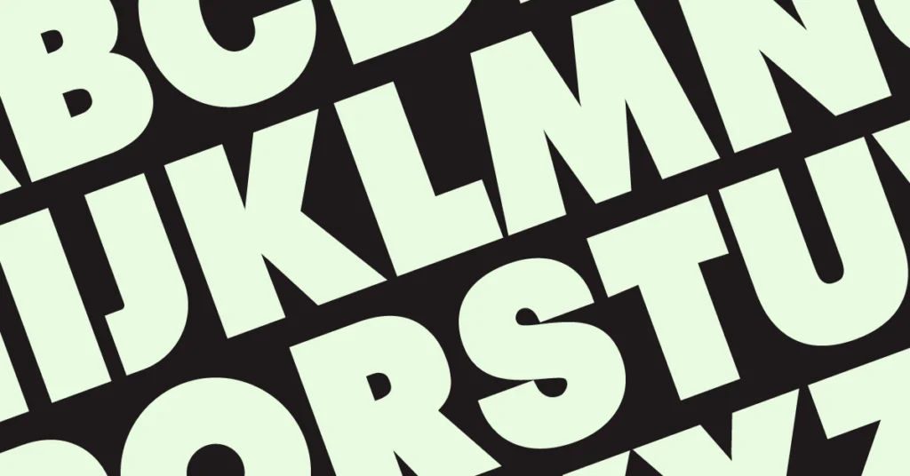
After seeing the big bold Futura logo on a T-shirt, I decided to make it more unique and more my own by creating a new font called THE LOGO FONT. It has the same strong impact as Futura but is more tailor-made for ENDDLESS. It felt like the missing piece — something that could finally bring consistency to the visual identity while keeping its experimental spirit alive.
And maybe this will also solve my headline font problem. A mockup using my new font alongside Courier seems to work, but I still have to test it on a full blog site with all headings. Like everything with ENDDLESS, it's a process, a constant state of refining and exploring. To be continued…